Delivering a Corporate Wide Design System
Honeywell was in desperate need to deliver software experiences, faster and with quality higher than ever achieved before; however separate businesses, development teams, and designers did not have the tools needed to create user experiences that delivered a unified Honeywell User Experience.
The team and I delivered a design system that bridges businesses, budgets, and disconnected development teams that improves design quality as well as speed to market.
Shortlisted - IXDA Interaction Awards 2019
Honeywell User Core Interface (HCUI) Kit – A Corporate Design System & Pattern Library Built through Strong Collaboration.
How a designer/developer responds when he finds out a close family member has type-1 diabetes.
Timely and accessible data is important to many people, for many reasons. For an insulin-dependent diabetic (type 1) patient, accurate glucose data is the difference between life or death. The current state of devices used by type-1 diabetics is dated, to put it mildly. Typically, data is trapped in proprietary silos, inaccessible for analysis and use by patients and caregivers.
I was intrigued by a group of “hackers” in the Nightscout (see http://www.nightscout.info) community that have been working hard to unlock that medical data, so I got involved.
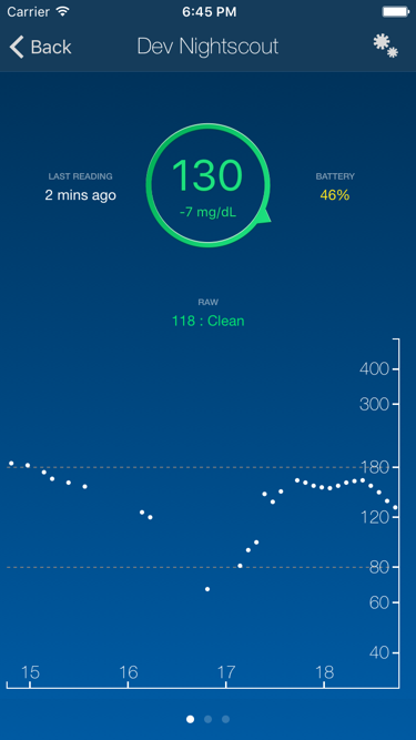
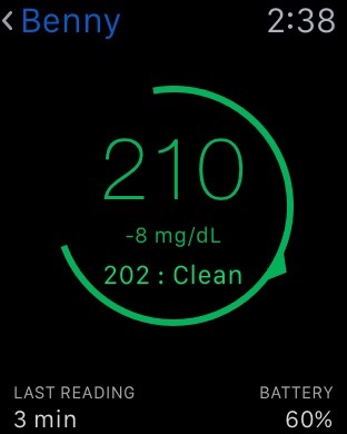
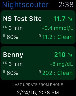
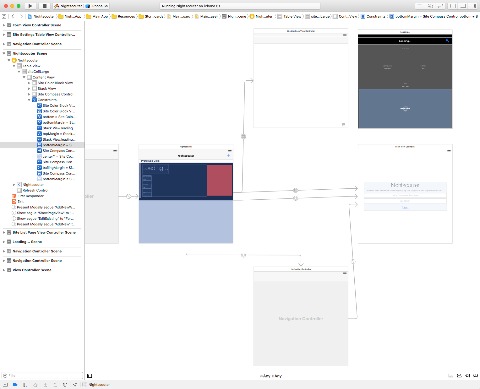
I created an app called Nightscouter which leverages data created by Nightscout and its foundation. I wanted to display continuous glucose monitor (CGM) information stored in the cloud on Apple iOS devices like the iPhone and Apple Watch.
Nightscouter was/is the first project in which I solely crafted and delivered the strategy, design, development, testing, marketing, and customer service from start to finish. It allowed me to not only help a community of users, but it expanded my knowledge of Swift and Apple’s various platforms.
Bring the power of SAS Visual Analytics to mobile with the goal of ‘design once and view everywhere’
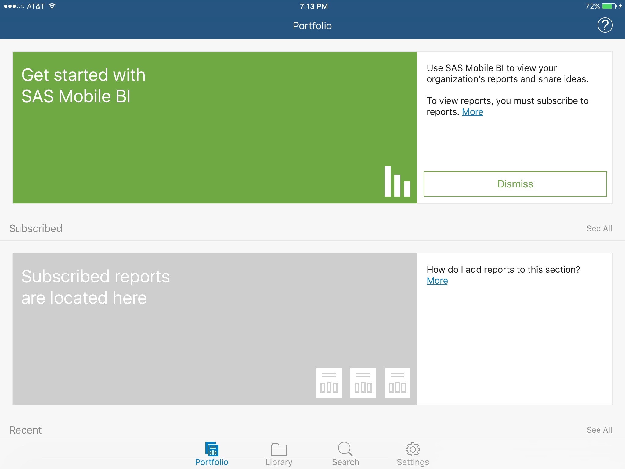
Target enterprise leaders who need business insight on the go. I served as user experience designer for a business intelligence reporting ecosystem that was made available on a variety of platforms.
We created apps for iOS and Android that deliver interactive, secure reports to business users on the go. The apps are currently available in both app stores.
I design-managed the user experience strategy for SAS Mobile BI on iOS, Android and Blackberry (note that the Blackberry part of the project was short-lived).
- To ensure consistency across various platforms, we identified common flows and use cases and then adapted them to the required platform’s paradigm. This ensured that key interactions were common across the ecosystem yet the apps felt native on the mobile devices.
- To achieve the goal of design once and view everywhere, I envisioned methods for mobile reports to include native mobile interactions despite being designed with desktop browsers. For example, mouse interactions adapted to the screen sizes and interaction paradigms like touch on mobile platforms.
- To make complex reporting interactions understandable, I made sure users could do no harm by tapping and swiping inside the report. I brought common actions to the surface and made sure it was as easy as possible for the user to make the right choices.
- We had to work within the boundaries of what was available from our server. This meant we had to be creative about how and when we enhanced the app.
SAS Mobile BI: https://itunes.apple.com/us/app/sas-mobile-bi/id511030524
SAS Visual Analytics: http://www.sas.com/en_us/software/business-intelligence.html#mobile-bi
Make the physical digital.
Target a growing market segment that wanted a rich multimedia playback and capture by providing them with a product that was uniquely designed for their needs and use cases.
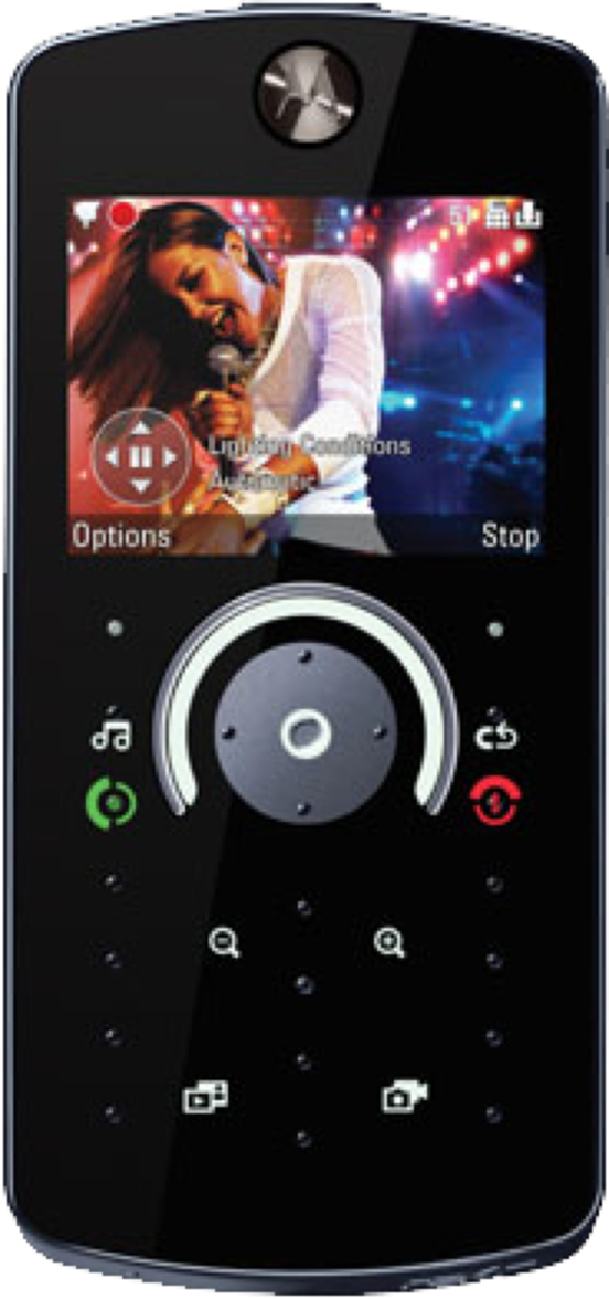
While collaborating with an extremely talented team of engineers and designers, we created a unique mobile phone that was focused on media playback and capture.
The ROKR E8 featured a dynamic keypad that reacts or "morphs" in response the user interface and the actions the user takes. The keypad was capable of showing and hiding a sets of keys for tasks like music playback and camera.
We encountered a few problems along the way as this product was the first of its kind, but for every problem we created innovative solutions.
- To give users the illusion of physicality, we created a flat keypad with subtle micro-bumps that provided tactile registration marks for accessibility and reinforced those tactile cues with haptic responses.
- To make an aging user interface intelligent enough to communicate context and user intention to the hardware, we documented a series of user scenarios and state machines that managed the state of the keyboard.
- As as a result of this project, we created a delightful surprise and engaging product that elicited delight and surprise from our users and created some important intellectual property for Motorola.
Collaborate with Apple to bring the iTunes experience to mobile.
Transfer knowledge of Motorola’s mobile user interface paradigm and strategy to Apple and guide them through the process of designing what was the first and only non-Apple device to feature a branded iTunes music player.
This resulted in the ROKR E1, the first mobile phone with iTunes which allowed users to sync copyright protect music to the device using Apple iTunes. While this was a great success, it was short lived as at the same time Apple also announced the iPod nano, and subsequently the first iPhone shortly after this product was launched.
Throughout the development of this Java Applet, I worked closely with both Apple’s and Motorola’s engineers and leadership to ensure we delivered information that was both relevant and protected intellectual property.


